Without fail, guests that come into our tasting room mention how beautiful the space is. A lot of that is - of course - based on the awesome brick walls and archways that were already here when we got here. But we did make some (many, actually) design decisions, which we wanted to share with you all.
We have always had a pretty distinct vision for our brand (learn more about those in previous blogs about how we came up with our logo and the sign we had made for the building). We wanted clean, modern lines and decor. We wanted to enter the market with a fully-formed aesthetic instead of kind of fumbling into it after several false starts. That meant spending money at the outset on a graphic designer, marketing materials, and interior designers, but it was well worth it.
The best decision was working with Heidi Lofton, a good friend and design student, who helped conceptualize and bring into fruition the ideas that we had. We had several meetings to talk through our vision for the space and based off of these conversations, she came up with everything you see in our tasting room today.
We started by picking a floorplan that would allow us to add seating in the future and show off some of Matthew Osborn's great furniture (more on that in a later blog).
Then we got to work putting together some ideas for finishings. Given how rustic and dark the interior of the building was, Heidi encouraged us to go with light, clean finishes, both for contrast and to help the natural features of the space stand out. That meant light, natural wood tables (made of ash, of course), extra-large white vertical subway tiles on the bar, so as not to conflict with the pattern of the brick, and a super-light concrete counter top. Heidi found some great seating options on Overstock.com and included them in her next sketches of the space.
We were all still on board with the vision, so Heidi created a complete rendering of the space, including artwork on the wall (hopefully coming soon!) and a window-bar that we will add sometime in the future. Here's the crazy thing - she had never actually been in the tasting room yet because it was still under major construction and we didn't have a key! If you've been in the tasting room, you'll be able to see how spot-on her renderings are.
The final product. Incredible!
Heidi also helped us come up with the idea for the light fixture over the standing bar, saving us literally thousands of dollars by using natural elements and building it ourselves instead of buying a more standard fixture.
Sparse and natural homemade light fixture. Air plants and large Edison bulbs are an easy way to make something really nice!
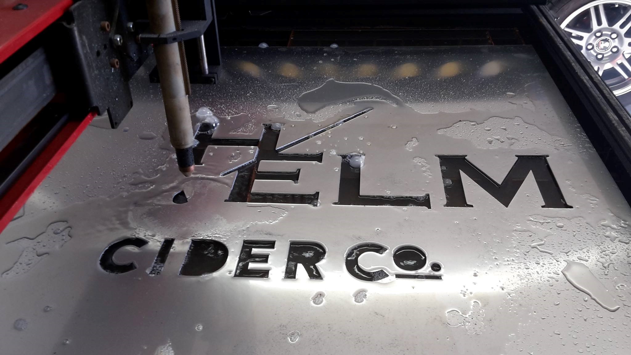
Lastly, our friends Jason and Lara who built us the awesome sign for outside of our space had a great surprise for us right before we opened. They had made the sign once, realized the weight of the aluminum was a little too light, and re-made it with a thicker piece of aluminum. They gave us the original piece to do with what we desired. It was a no-brainer that we had to put it up in the tasting room. Add a little bit of flexible rope lighting and voila - an incredible statement piece of art in the back of our space.
Perfect place for pictures.
So, there you have it - how we came up with such a beautifully designed space!


